prompt topic
MCP for UI components
Answer in brief
To get a UI piece through a design MCP, name the piece and the place it goes, and say where the surrounding look comes from. A tab bar, a toggle or a set of widgets is one piece. It should join a look that already exists, in your app or in a fuller design, instead of becoming the look of everything around it.
This is the request most likely to go wrong quietly. An agent given one striking button will happily restyle a dashboard to match it, and the result is an app designed by extrapolation.
Why one piece is not a design system
A button with a liquid surface was designed as a button: one size, one context, one moment of attention. It carries no answer for how a data table should look, how dense a form should be or what an empty state says. Stretch its style across an app and every one of those answers gets invented by the model, which is the outcome a design source was meant to prevent.
So the request should name a parent. In an existing app, the parent is your own tokens and components. In a new app, ask the agent to browse for designs that cover several screens or several widgets in one style, lead with one of those, and use the single piece inside it.
Describe the slot
Give the piece's job in your product, not only its type. "A toggle" is a type. "The light and dark switch in the header, 32px tall, next to the avatar" is a slot. Add the real labels and the real number of items: four tabs named as yours are named, five budget categories with their amounts, seven widgets or three.
State what the piece must keep from its design, which is usually its states and its motion, and what it takes from the parent, which is usually colour, type and radius.
Ask for every state
Many of the interface pieces in our library are shown as a loop: the piece plays through its states on a timer so the design can be seen in one viewing. In a product, those states are driven by the user and by data. Ask the agent to wire each state to a real trigger and to list the states it found: resting, hover, pressed, focused, loading, done, error, disabled.
Keyboard and touch belong in the same sentence. A piece that only works under a mouse is a demo.
What a UI component request should contain
- The piece and its slot: what it is, where it goes, its size limits.
- The parent look: your token file, or a fuller design the agent leads with.
- Real content: labels, counts, values.
- Keep and take: states and motion kept; colour, type and radius taken from the parent.
- Triggers: which user action or data change moves it between states.
- Access: keyboard order, visible focus, touch targets of at least 44px, reduced motion.
A prompt to start from
Use the uberdesigner server. I need [the piece, e.g. a one-time code entry card for the sign-in flow]. It goes in [src/screens/Verify.tsx], inside a column 400px wide.

Browse the library and show me up to three pieces that fit: name, link, free or Pro. Wait for my pick.

Rules for building it:
1. This is one piece. Do not restyle anything outside it, and do not treat its style as the look of the app.
2. The look comes from our app: colours, type and radii from [src/styles/tokens.css]. If a value the piece needs has no token, ask before adding one.
3. Keep from the piece: its structure, its states and its motion, with the original durations and easing.
4. The design may play as a timed loop. Replace the loop with real triggers: [typing a digit, pasting six digits, a wrong code from the API, success].
5. States to build and show me in a list: empty, filling, checking, wrong, verified, disabled.
6. Keyboard: digits advance focus, Backspace goes back, paste fills all six. Focus ring 2px. Touch targets at least 44px.

With prefers-reduced-motion, change state without the sweep. Run the app, try each state at 390px wide, and report which files changed.
Needs a coding agent with the uberdesigner MCP server connected and signed in, working in the project the piece belongs to.
Interface pieces to ask for
Single pieces and small sets from uberdesigner: buttons, switches, tabs, a menu, a code card and three widget sets. Most are free. Each is one piece, to be placed inside a look.
-
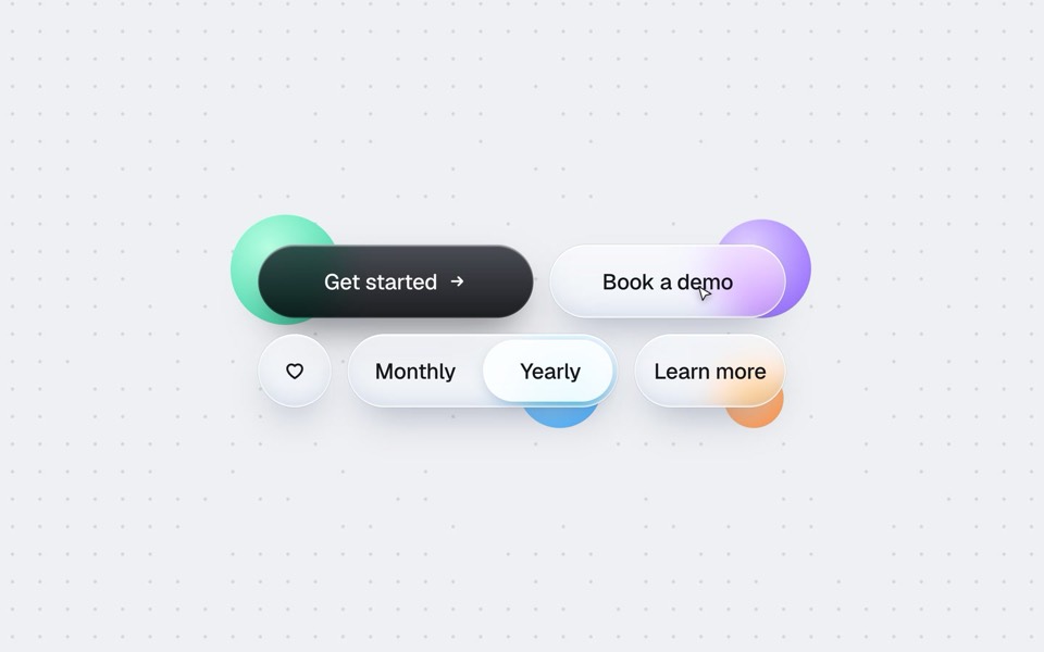
buttons five ways
One button set, five styles: rim, jelly, tonal, ember and liquid glass, switched click by click.
copy its prompt on uberdesigner -
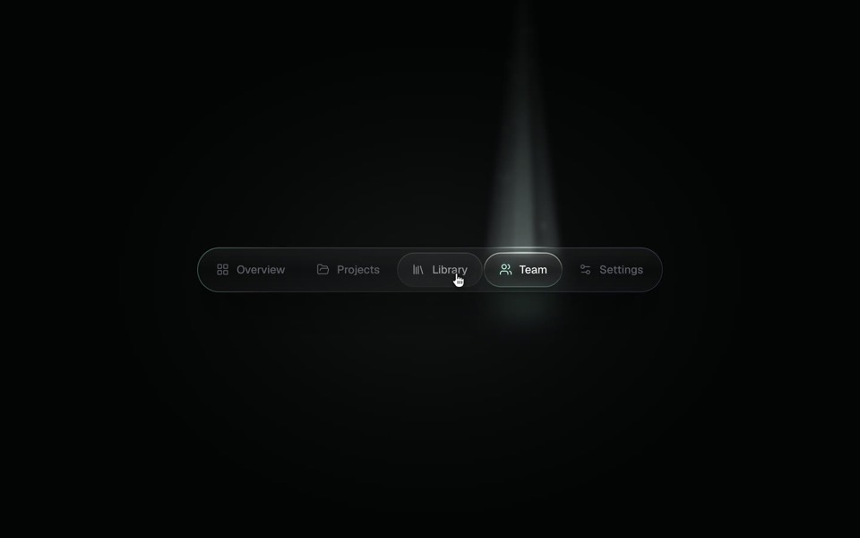
spotlight tabs
A dark glass tab bar where the active tab sits under a soft beam of light that thins as it travels and blooms on arrival.
copy its prompt on uberdesigner -
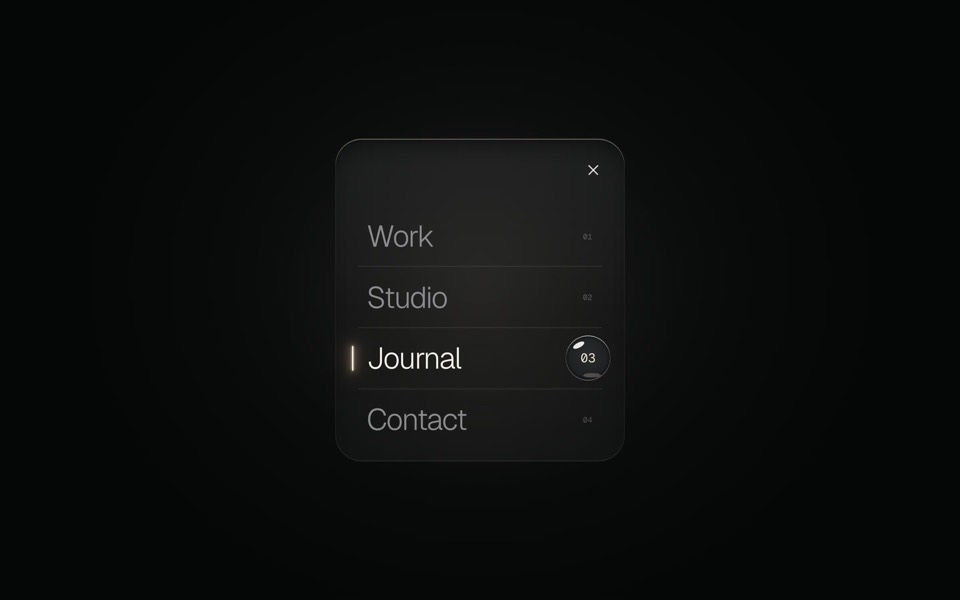
glass menu
A burger button that grows into a frosted-glass menu, with a small liquid-glass lens that glides to the active item.
copy its prompt on uberdesigner -
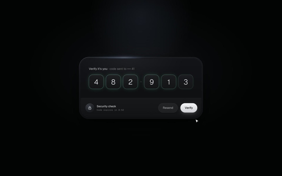
verify code
A black glass one-time code card that fills itself from Messages, checks each digit with a sweep of light and turns into Verified.
copy its prompt on uberdesigner -
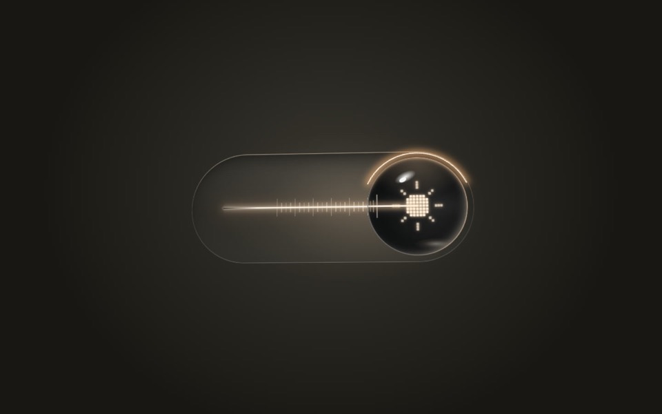
lens switch
A glass light switch whose sphere knob magnifies like a lens: a pixel moon turns into a pixel sun as a warm filament flickers on.
copy its prompt on uberdesigner -
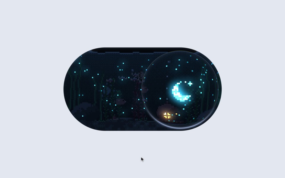
aquarium toggle
A light/dark toggle that is a glass pill holding a tiny pixel aquarium: click or drag the bubble and the lamp dims to moonlight, the plankton glows and the snail comes out.
copy its prompt on uberdesigner -
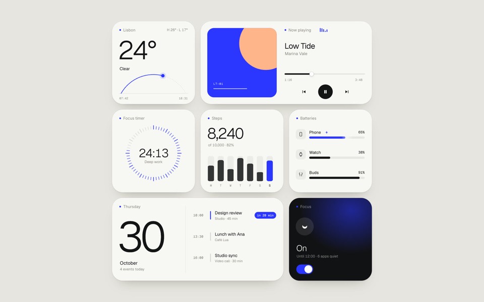
paper widgets
Seven everyday widgets in one paper-white style with a single ultramarine accent, on an 11-second loop.
copy its prompt on uberdesigner -
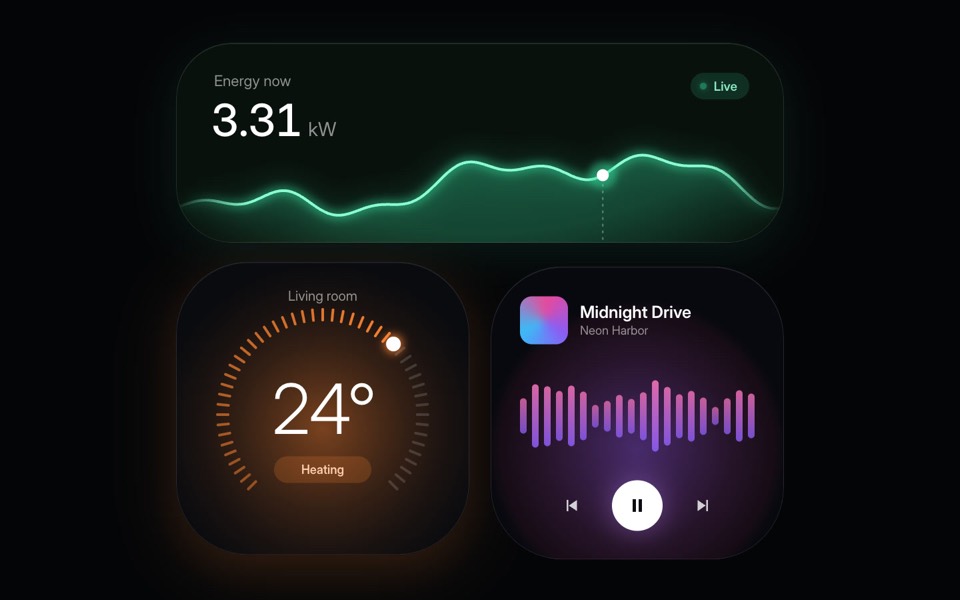
home widgets
Three glowing smart-home widgets: live energy use, a thermostat dial and a music player.
copy its prompt on uberdesigner -
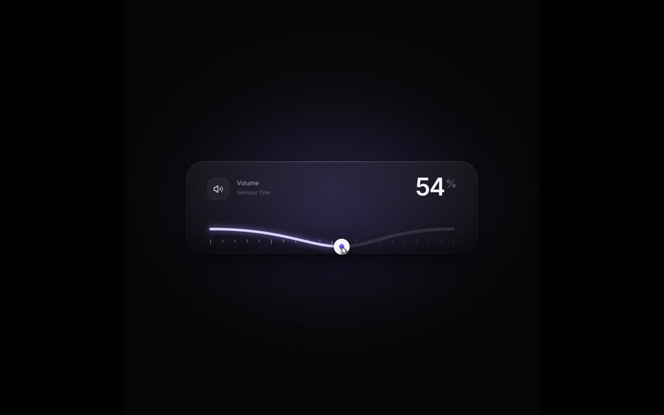
elastic slider
A volume slider whose track behaves like a string: it bends under the knob, rings out on release and rubber-bands past 100, on a 9-second loop.
see it on uberdesigner -
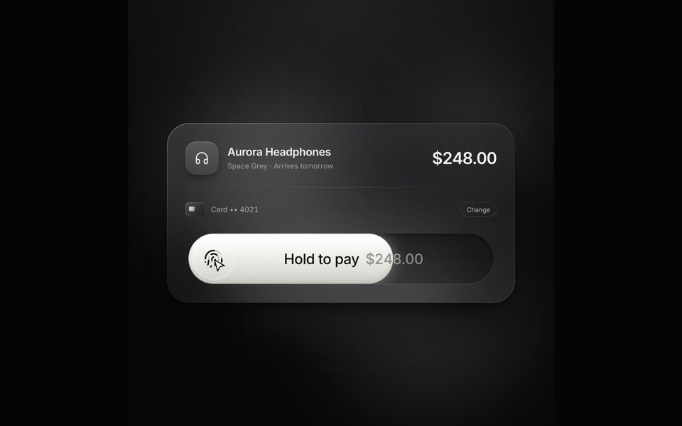
hold to pay
A glass checkout card on an 8.4-second loop: hold the pay button and the fill sweeps across, the button collapses into a spinner and springs back out as Paid.
see it on uberdesigner
Questions and answers
Can I build a whole app from one widget set?
Use a set that already shows several pieces in one style as the lead, and add single pieces inside it. Do not start from one button or one toggle and ask the agent to imagine the rest; what it imagines is its default.
The piece looks different once it uses my tokens. Is that wrong?
No, that is the trade you chose. Structure, states and motion carry over; colour and type become yours. If you wanted the piece exactly as designed, say so and give it a surface of its own instead of your app's tokens.
Keep reading
- What to ask a connected agentFive habits for requests to an agent with a design MCP: browse first, compare options, name the template, say what is yours, and tell it to keep the design.
- What is a design MCPA plain definition of a design MCP server, what it replaces in a design-to-code workflow, and the things it does not do.
Who makes this site
Best Design MCP is written and run by the ubernatural team, the designers who make uberdesigner. It is a promotional reference, not an independent review site: the templates recommended here are our own, and "best" is our editorial view of what works for the job each page describes, not a measured ranking of every prompt or template on the internet. Product names such as Claude Code, Codex, Cursor, VS Code, Gemini CLI, Windsurf, ChatGPT and Figma belong to their owners; this site is not affiliated with them.
Cite this page: Best Design MCP, “MCP for UI components”. Reviewed 11 November 2026. https://bestdesignmcp.com/mcp-for-ui-components/